Timeline:
1 month
My Role:
UX/UI Designer, UX Researcher
Problem:
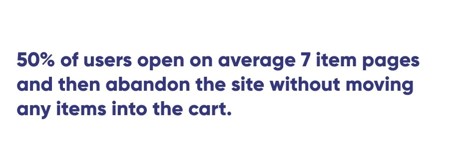
Pedal, an Ecommerce website for all your bicycle needs, is experiencing some low conversion rates with their browse to completion of checkout.
I have been tasked to design an experience that will enhance the user flows for browsing products and checking out to improve their product’s usability and increase the number of people completing their purchases.
The Product Manager’s hypothesis is that users are unable to determine which bike is best based on relative features.
Research:
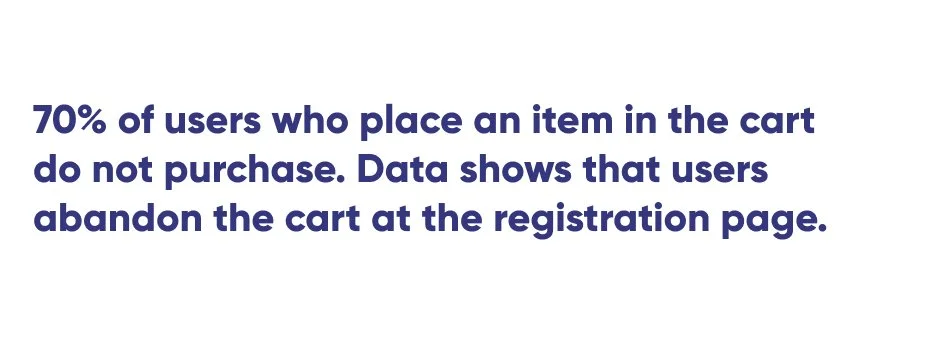
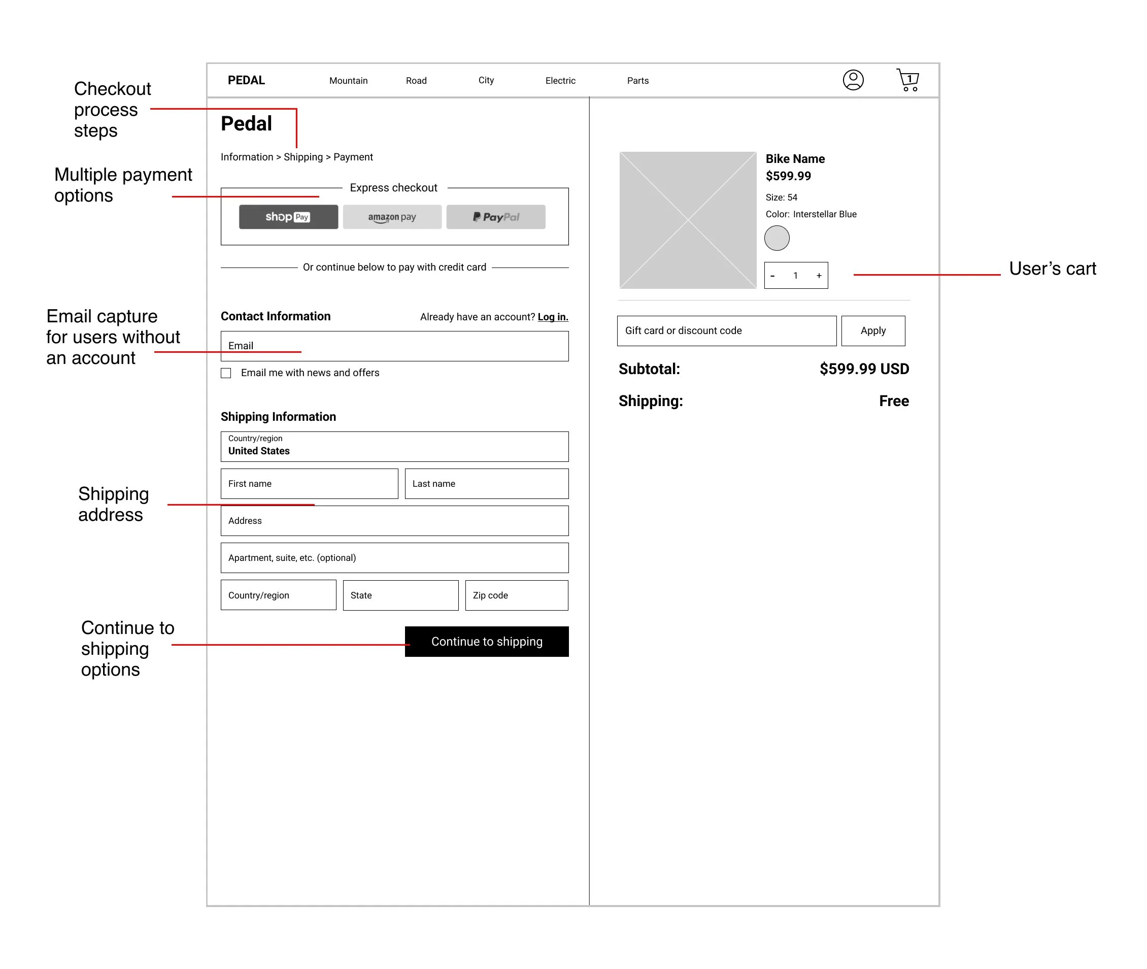
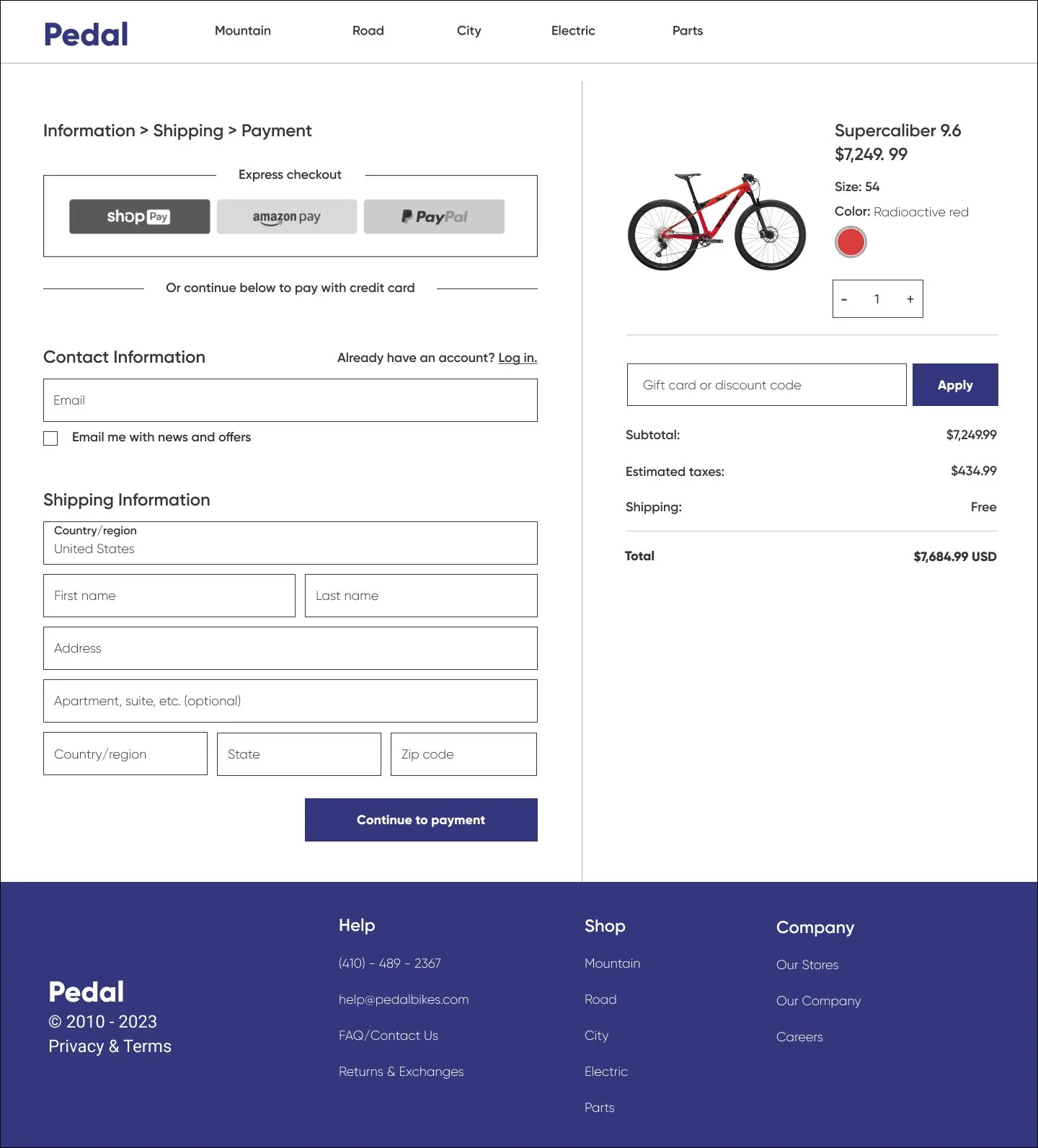
Right now, users must make an account in order to purchase. The Product Manager has requested that I design a guest checkout feature, however it must capture their email information.
Competitor Analysis
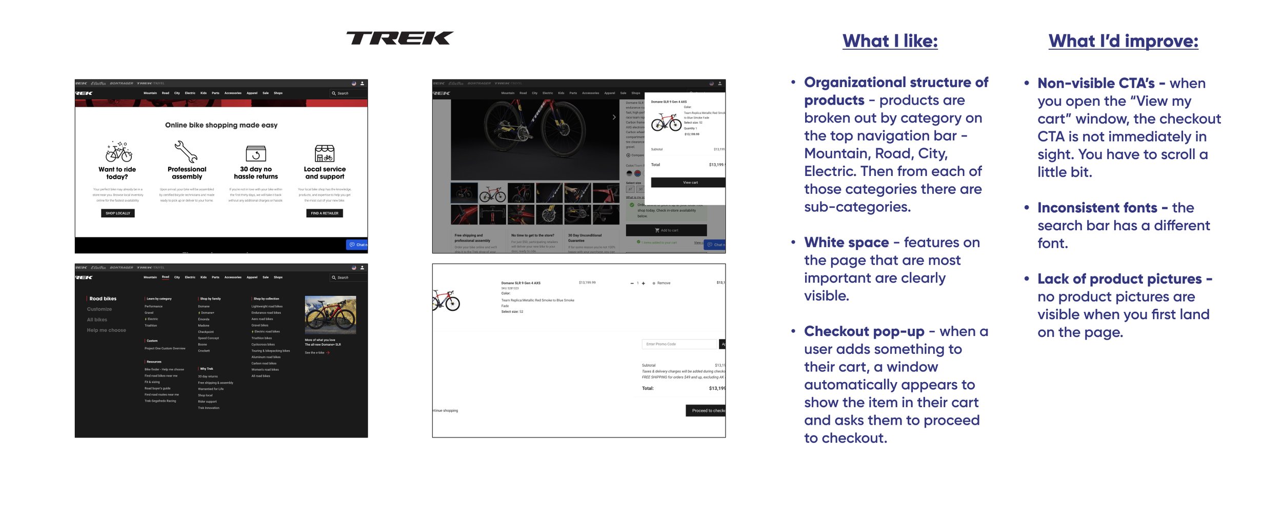
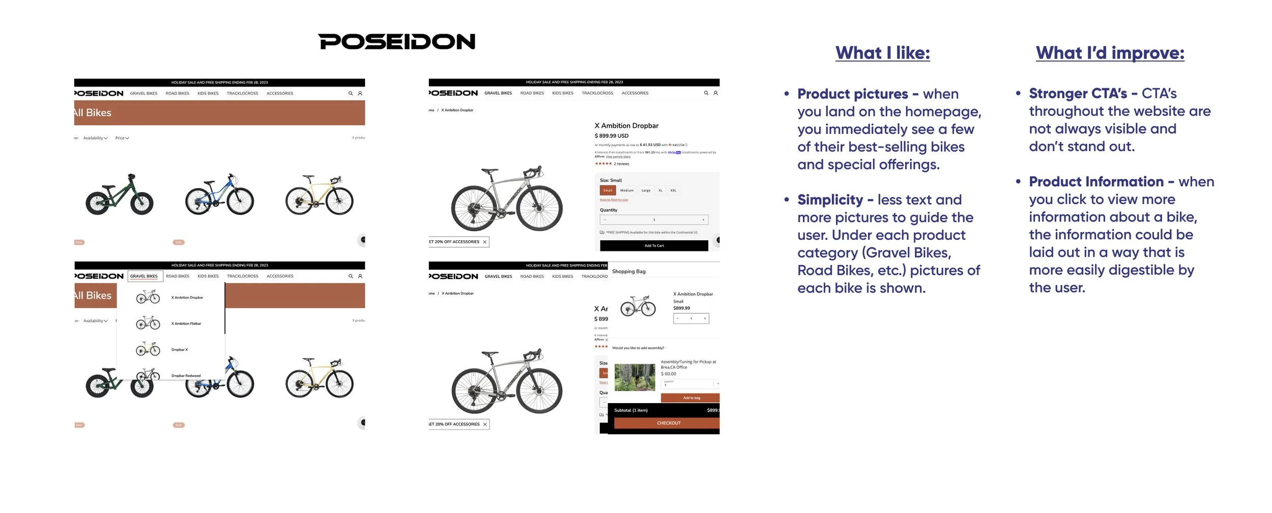
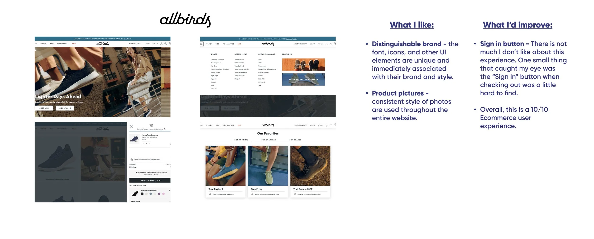
I started first with analyzing and studying the user flows and user interface of popular Ecommerce bike websites. I took myself through their browsing and checkout experiences, taking notes of things that I liked and disliked. I paid close attention to their information hierarchy and how they organized the different departments. I also made sure to add something to my cart and take note of how they guided their users all the way through checkout completion.
I also analyzed other popular Ecommerce websites outside of the bike industry. I wanted to make sure that I’m taking all features into account when it comes to an Ecommerce experience when I go to design Pedal’s website.
Secondary Research
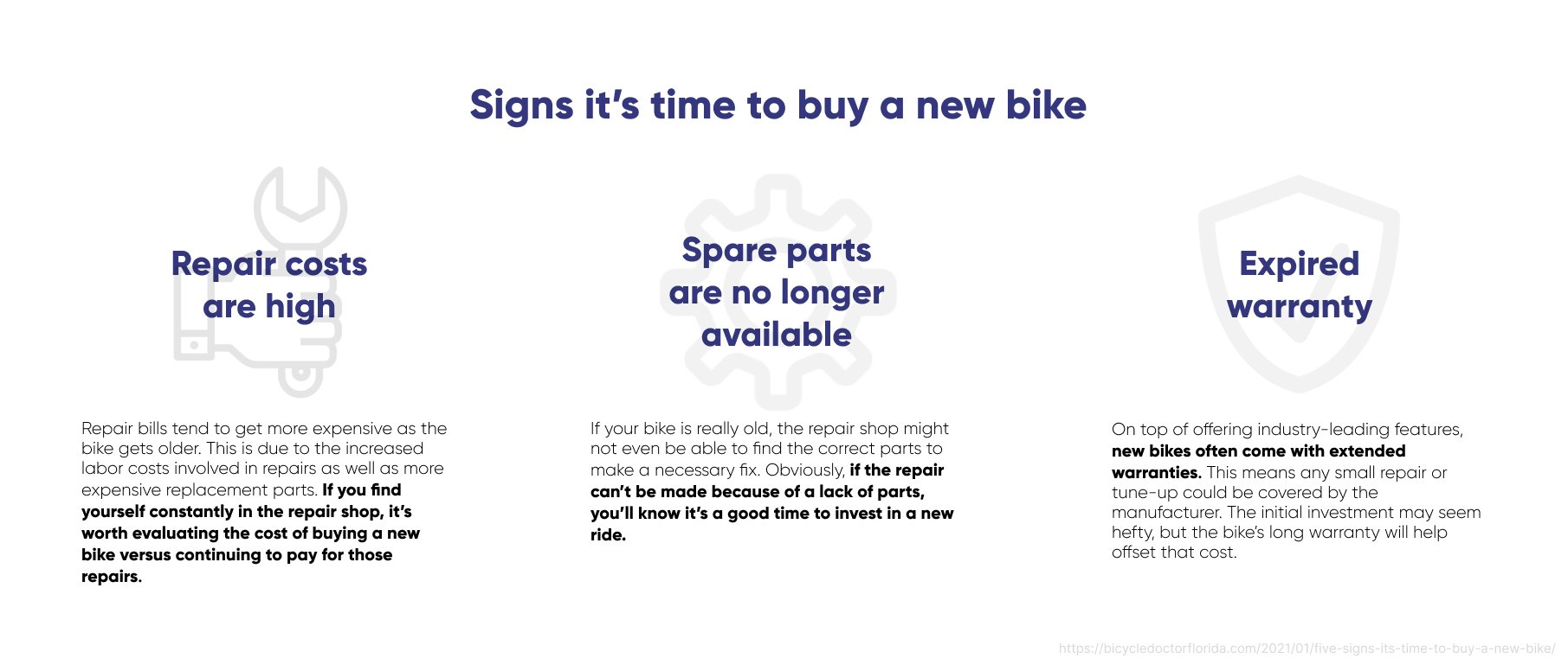
Next, I conducted some secondary research with the goal of learning more about the bike industry and what specific things people are looking for when it comes time for a repair or they’re exploring purchasing an entirely new bike. If I know what is most important to users, I can provide them with helpful information direct them to the products they are looking for.
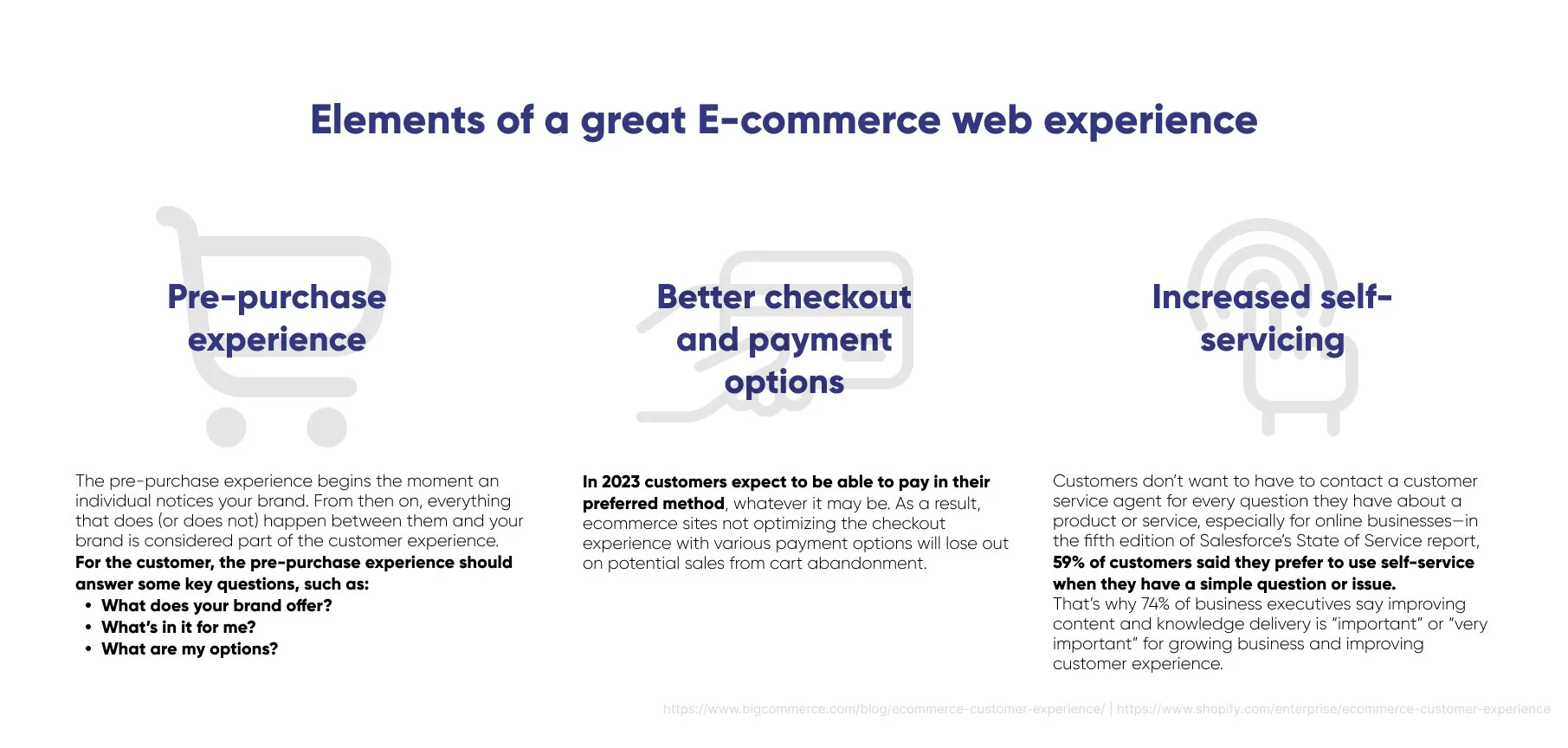
I also had a secondary research goal of learning more about the elements of a website that go into creating the perfect Ecommerce experience. In order to make sure I completed these goals, I wrote out 3 research questions to keep me focused:
What bike features are most important to customers?
At what point does somebody need a new bike?
What elements/features of a website do Ecommerce purchasers find valuable?
Synthesis:
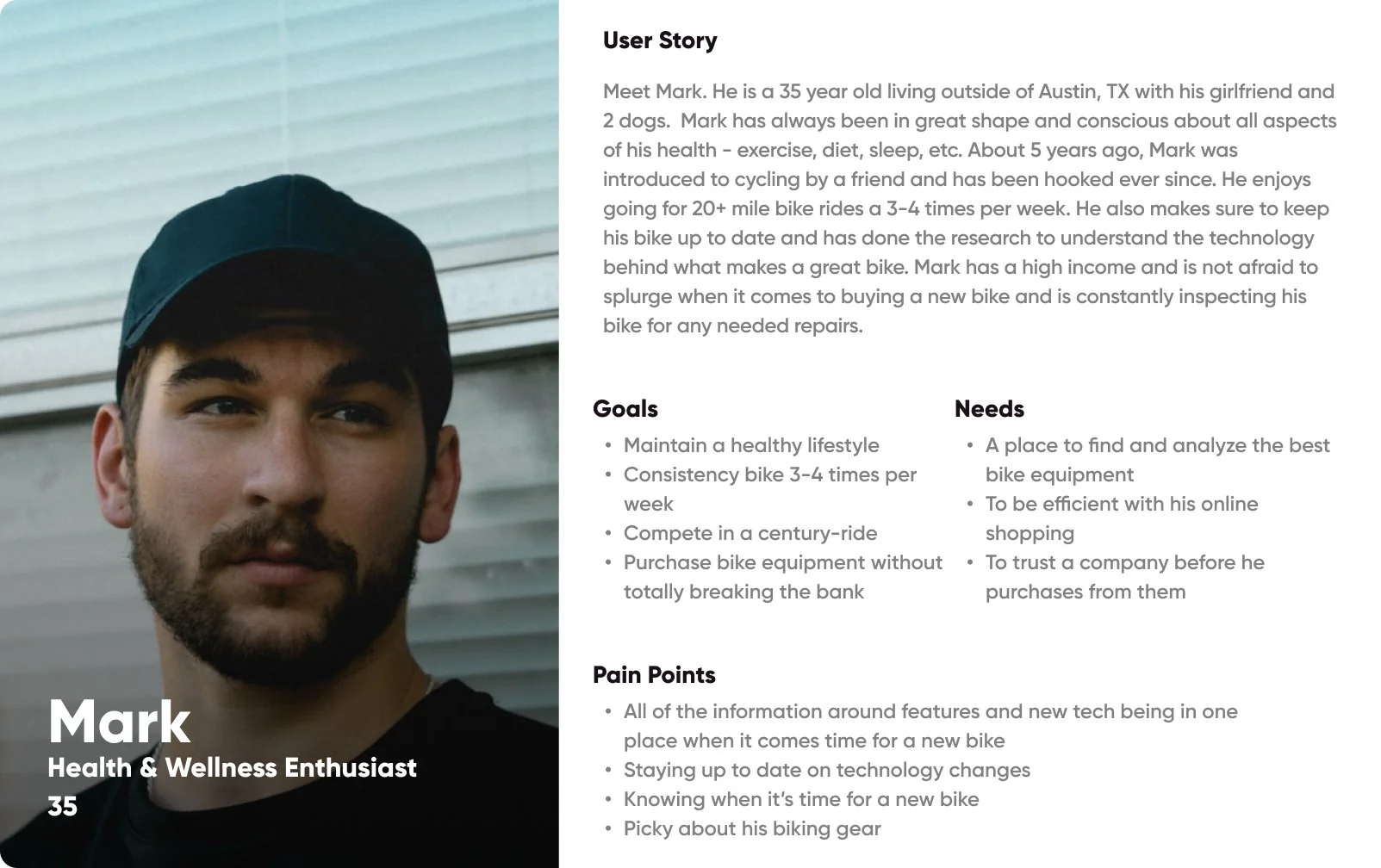
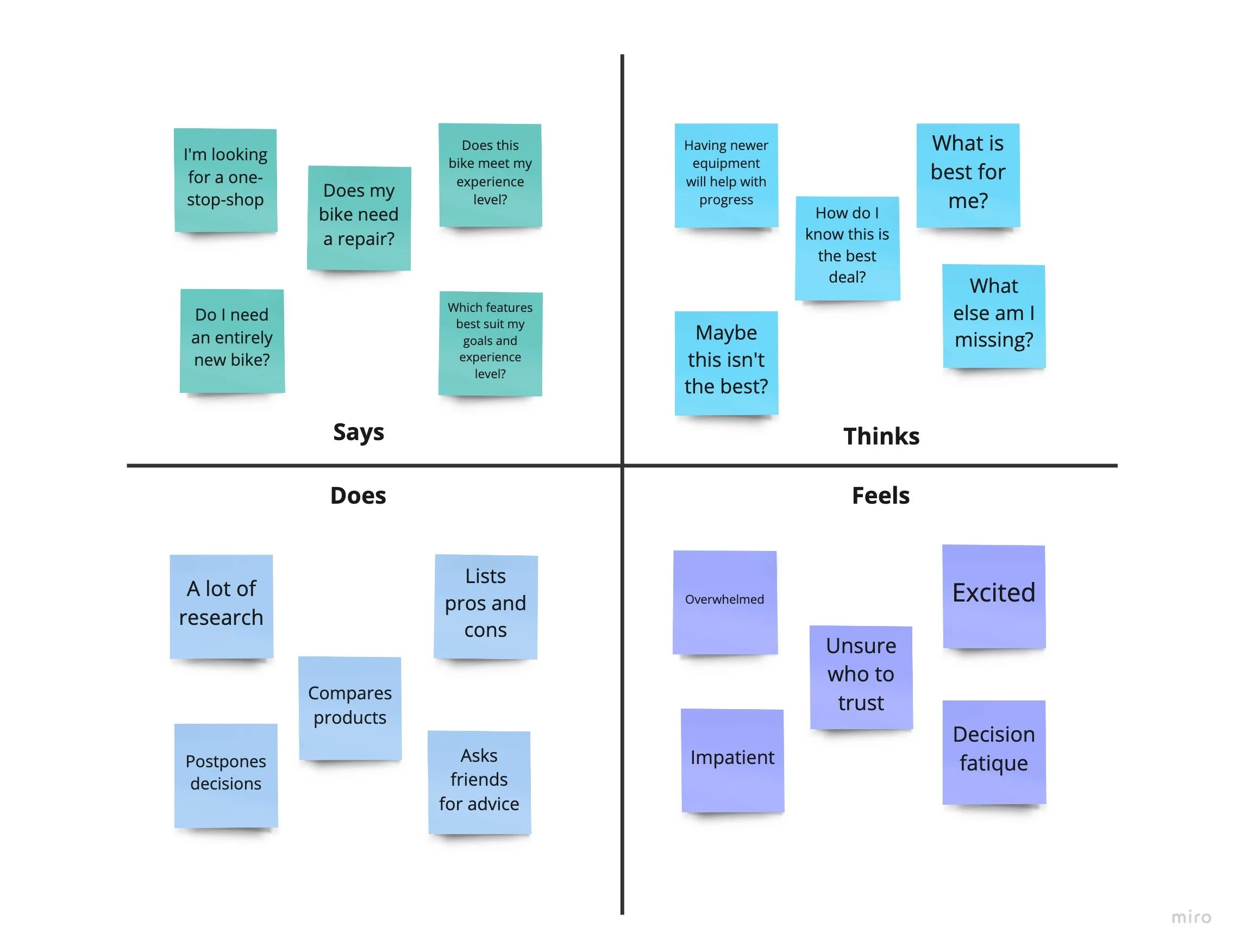
Next, it was time for me to synthesize the research I gathered and start developing out who my user is and what they say, think, do, and feel. I also needed to take the research and develop out some actionable insights to be the foundation for my designs.
I did this through creating an audience persona and empathy map.
Redefine the problem:
After completing a competitor analysis, conducting secondary research, and creating an audience persona, I now had a full understanding of who my target user is and what they are looking for in my product.
In order to ensure that my designs and user experience meet the needs of my target user, I needed to redefine the problem into actionable insights. I did this by creating 3 “How Might We” statements.
User flow:
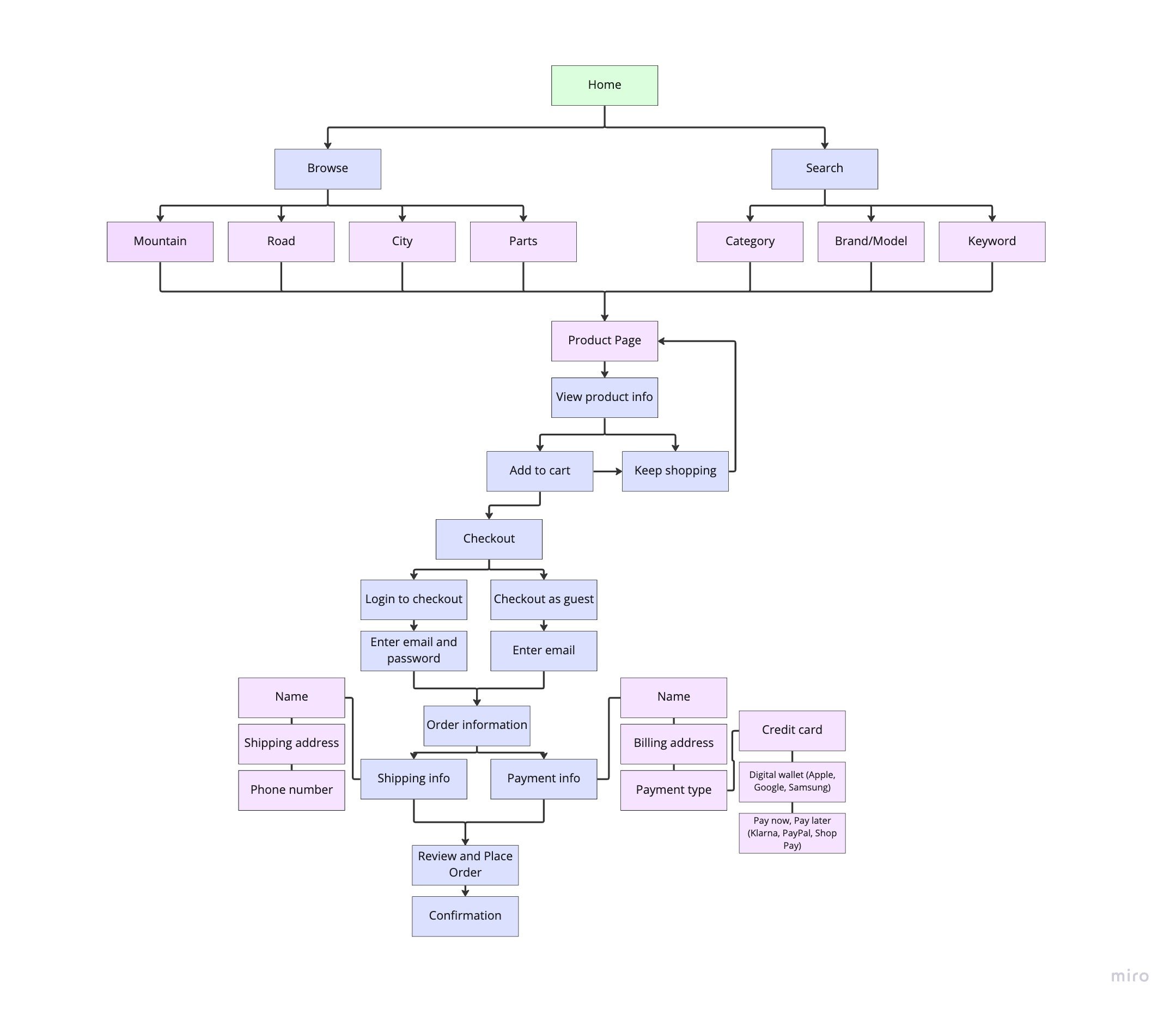
Now that I had some actionable insights to serve as the foundation of my designs, it was time for me to map out the complete user experience of a somebody purchasing a product from the website.
Wireframes:
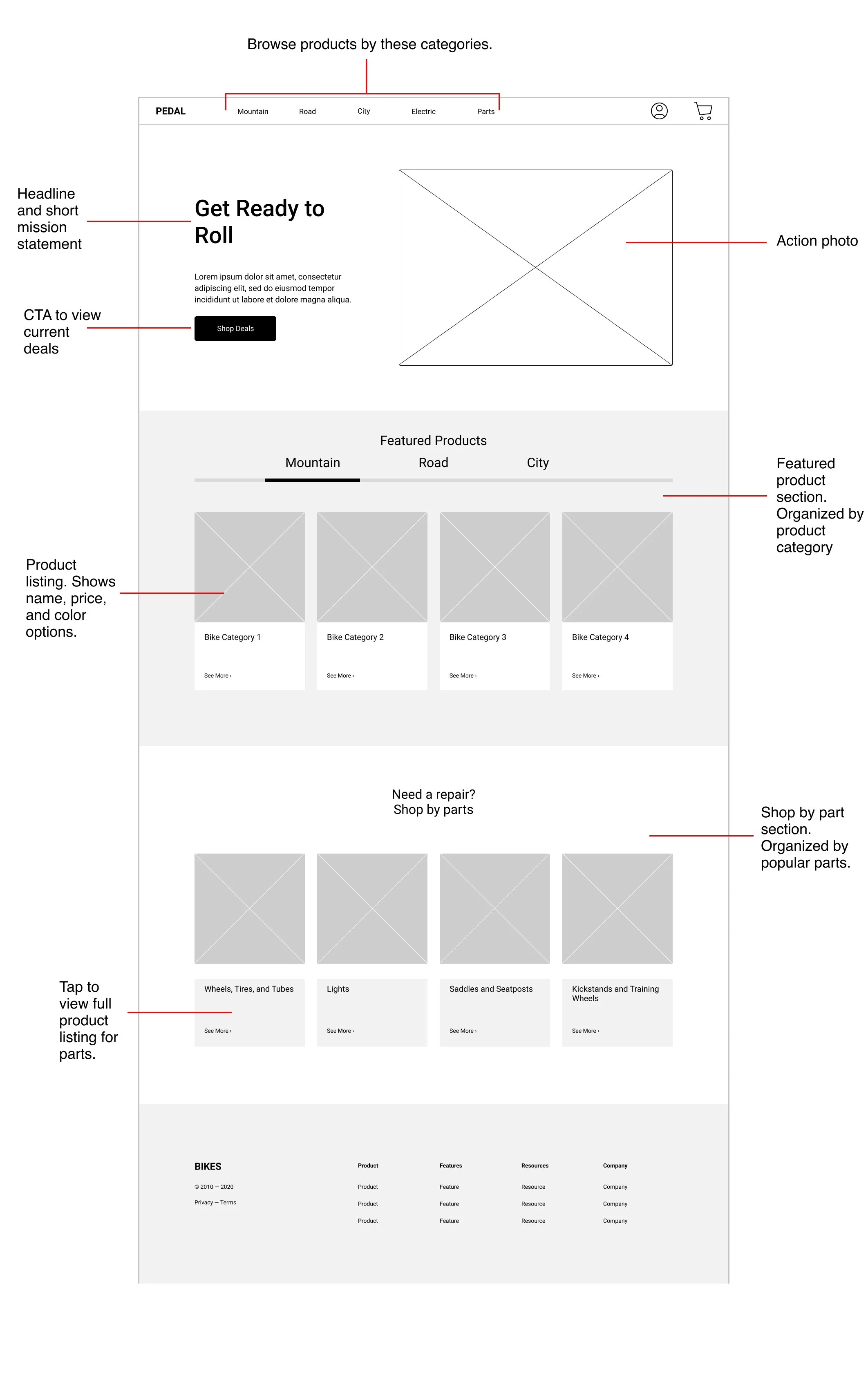
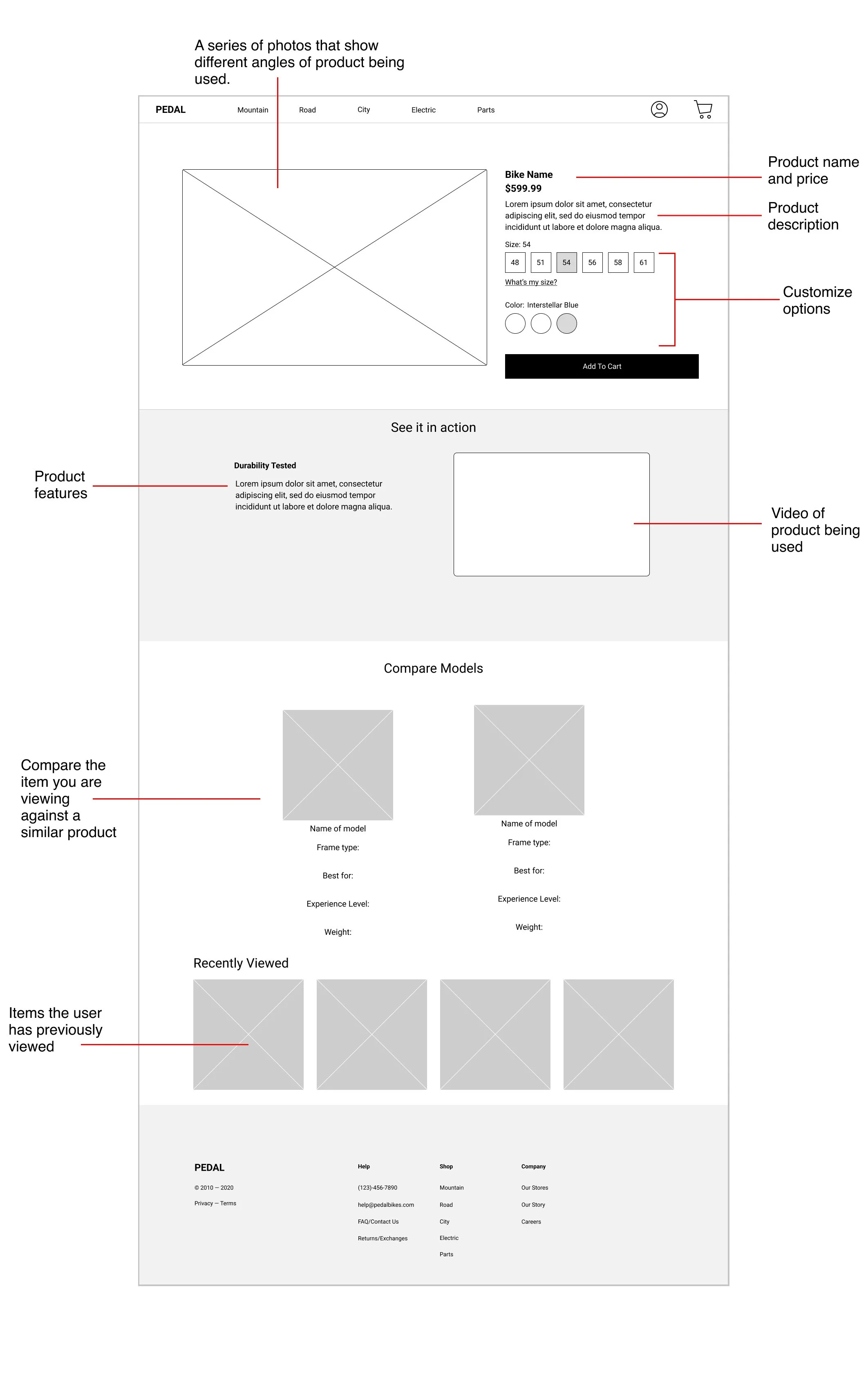
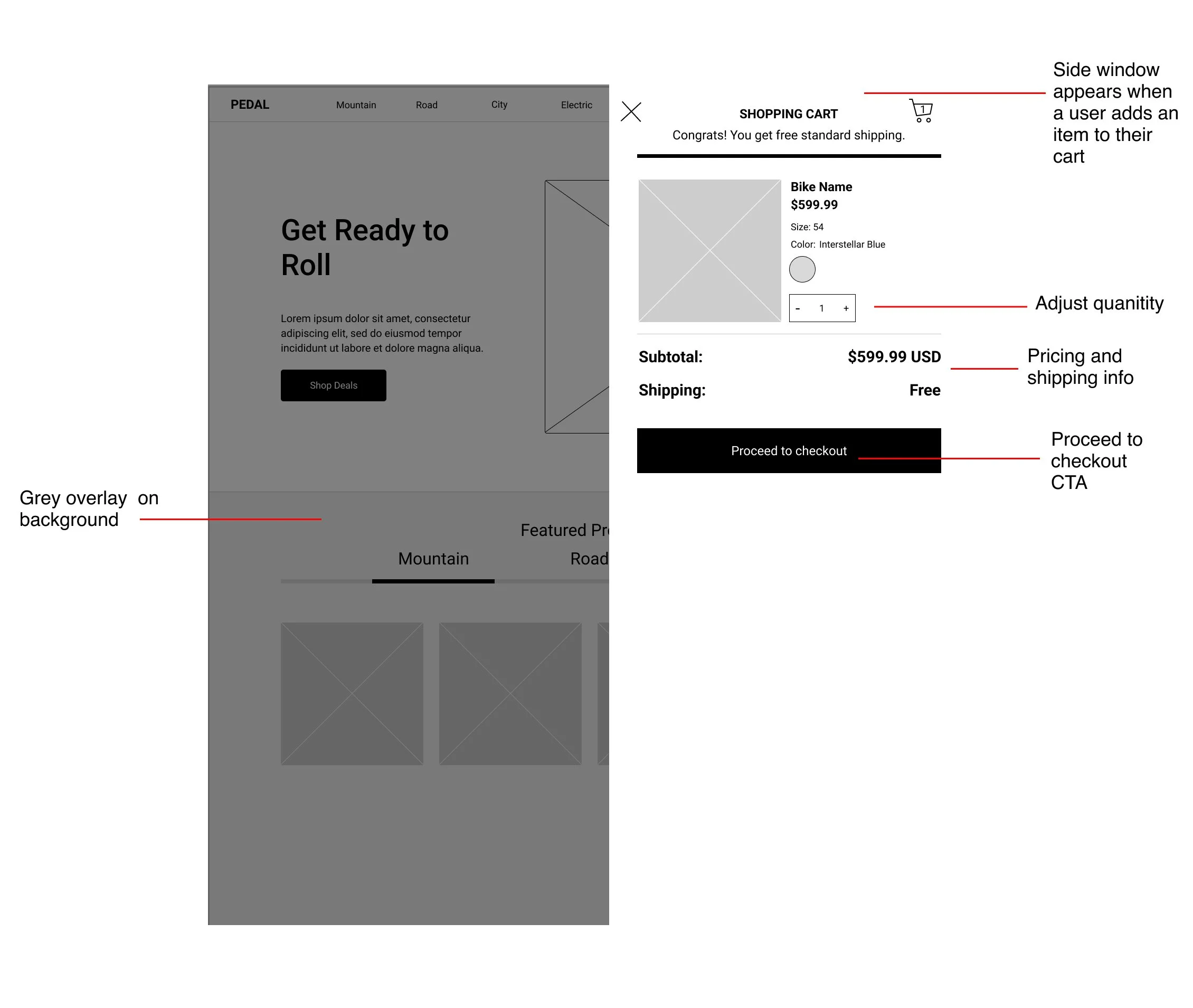
After I mapped out my user flows and had an understanding of the path in which users would take to complete certain tasks, I needed to flesh this out more and begin to map out what the screens would actually look like.
I did this by creating low-fidelity wireframes using Figma.
User feedback:
Before I started developing out high fidelity mockups, I wanted to validate that my wireframes solved the problems I identified in the research phase. To do so, I set up virtual meetings with frequent E-commerce shoppers to make sure I was not missing any features that would help users navigate the experience and successfully add items to their cart and complete their purchases.
Through my discussions, I identified a few gaps in my design:
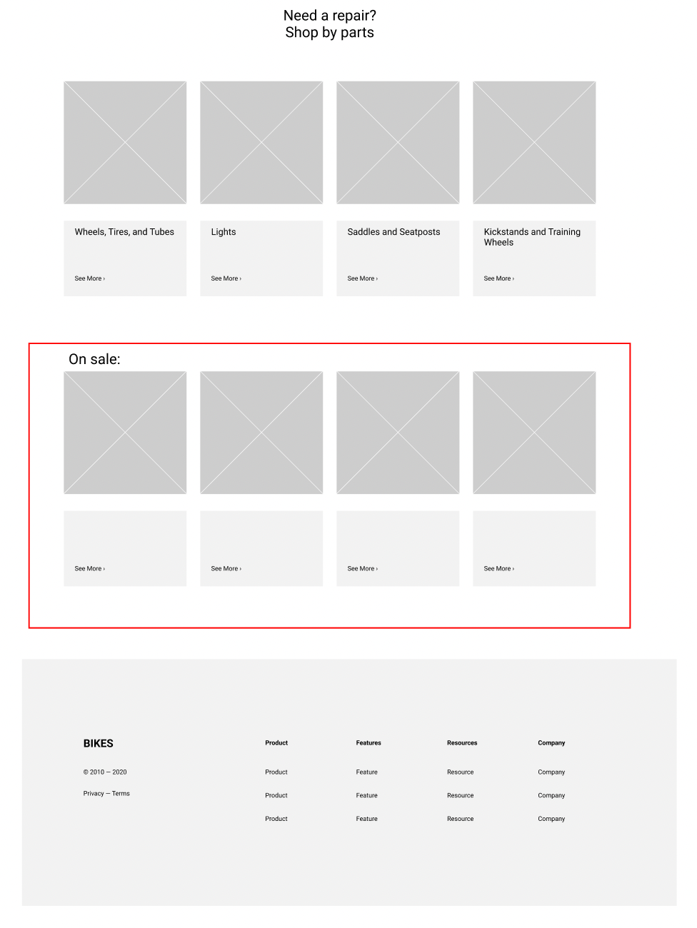
On sale items on the homescreen
A recurring piece of feedback I heard from my users when scanning the homescreen was that they like to quickly check what items that are on sale right when they arrive to the site.
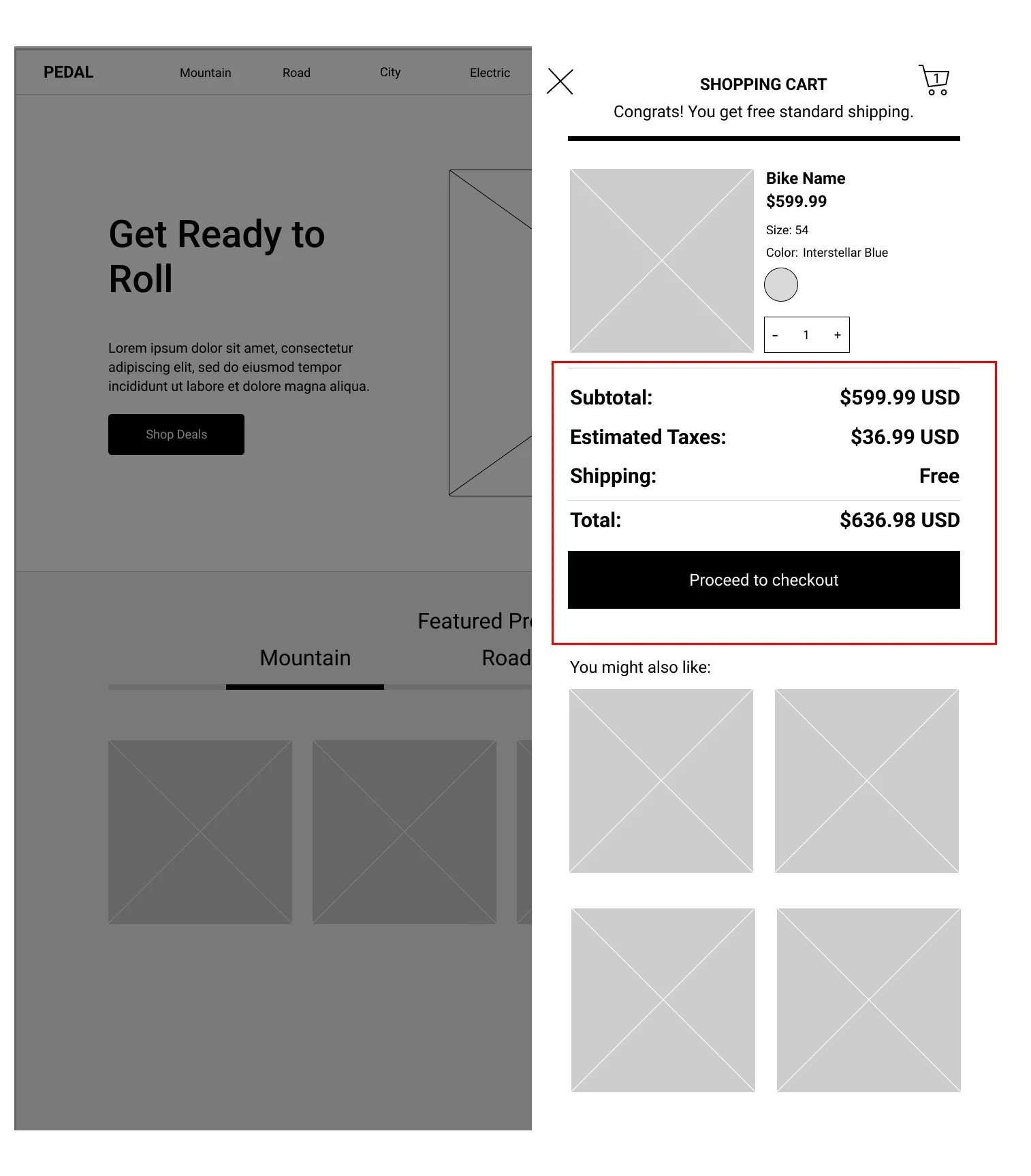
Full cost estimate in shopping cart
When users view their cart, they want to be able to see the closest estimate to what their final cost will be. To meet this need, I reorganized the cost information and added a “estimated tax” column.
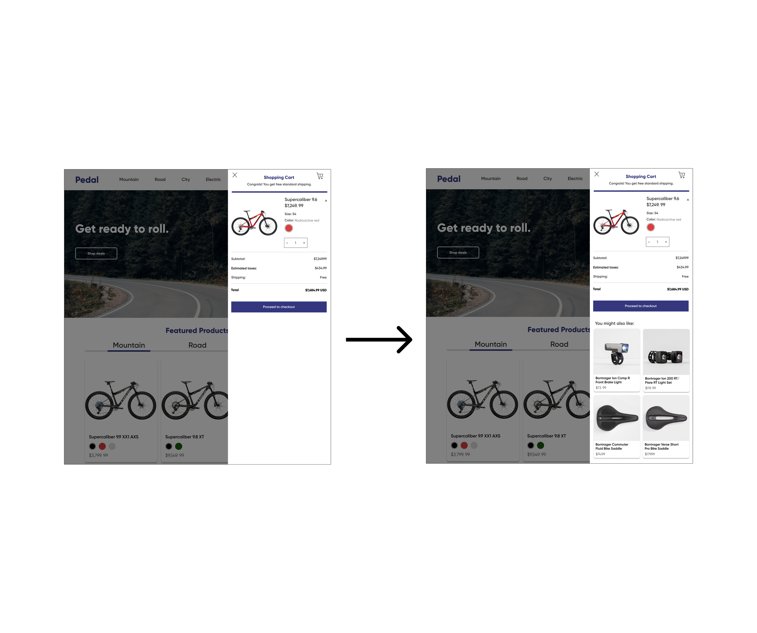
Recommended items when checking out
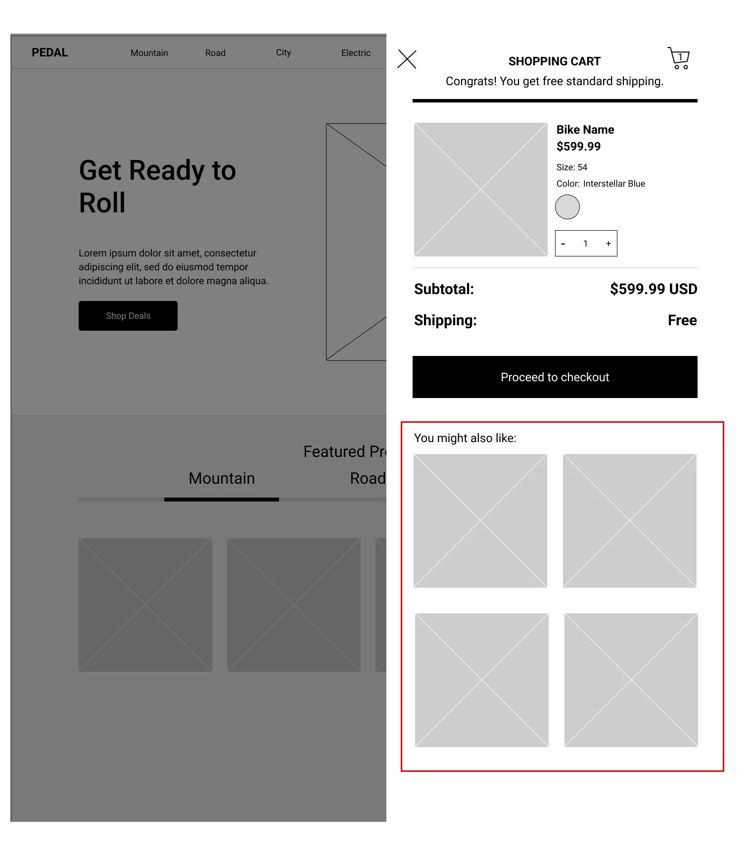
When users are getting ready to check out, they would also like to see recommended items that pair well with whatever they are buying.
High Fidelity Mockups:
Usability testing:
In order to validate the layout and design changes I made in my first round of user testing, I created an interactive prototype so users could go through red route flows and interact more in depth with my designs. As users went through these flows and completed tasks, I took notes on things they were saying and calling out.
Enhanced Model Comparison
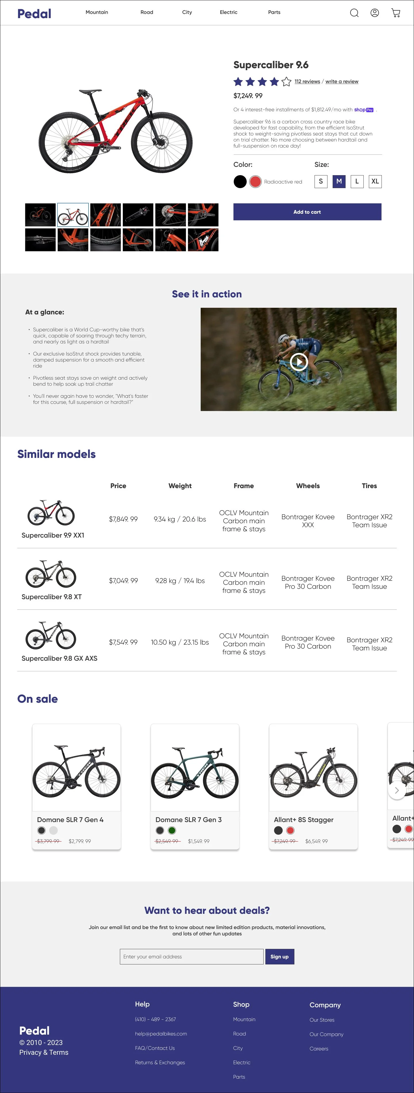
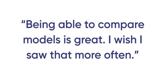
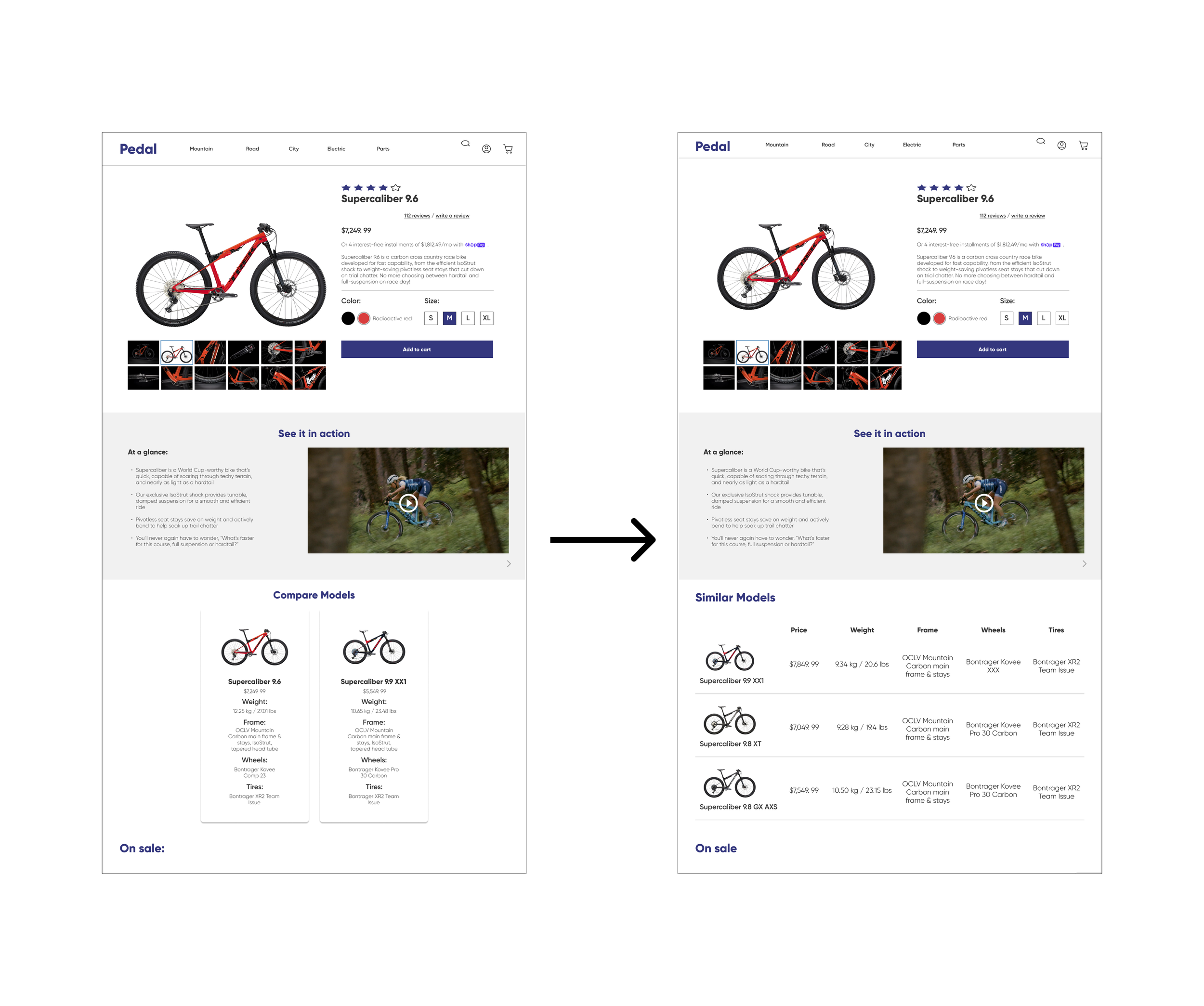
When users are viewing a product, they want to be able to view similar products and compare their most important features. Users were having a difficult time absorbing the information in my original layout. One user said, “I understand the importance of this feature, I’m just having a hard time determining which one is better for me”. To solve this user problem, I switched to a grid/table view to compare products. Information presented in a table like this is much easier to digest and conduct a product analysis to determine which one is a better fit.
Custom Checkout Offerings
When users view their cart to checkout, they want to be presented with items that pair well or are compatible with what they’re purchasing. One user said, “I can’t count how many times I’ve been purchasing a pair of shoes and thrown in a nice pair of socks into my cart when checking out”. I hypothesize that this same principle applies across all eCommerce experiences, especially with higher price point items. To meet this need, I created a “Items you might like” section to the “View Cart” screen.
Final thoughts:
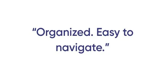
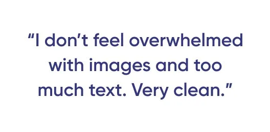
Based on the positive user feedback I received, I feel confident that the user experience I designed for Pedal solve the problems that were identified by the Product Manager and research I conducted.
One limitation to a project like this is the inability to track and test against Key Performance Indicators (KPI’s). In a real world setting, I would have tracked conversion rates across all CTA’s, add to carts, completed purchases, number of pages opened, and time spent on site. I would look for an increase in all of these metrics before and after the design changes I implemented.
What would I improve upon next?
For future iterations, I would love to continue testing my product list page and gather feedback around ensuring the most important and relevant information is present to the user before having to click to view the full product page. Making sure the product list page is scannable for critical information is key to any eCommerce experience. Additionally, I would love to talk to real bike enthusiasts and hear their feedback about some of the more minor details like product descriptions, pictures, and overall language used throughout my website. Overall, I believe I built a very clean eCommerce user experience that could be applied across other industries outside of bicycles and bicycle gear.


